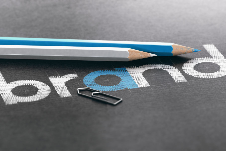
How to redesign your logo
Much like the fashion industry – trends in graphic design are constantly shifting. In terms of representing your company’s identity – a relevant, recognisable logo is absolutely paramount.
An emblem is never truly ‘finalised’ – even the most successful examples, namely; Nike and Coca-Cola have undergone various changes through the decades. It’s important to think of your symbol as an evolving piece of iconography – what resonates with audiences now, may not in ten years’ time.
As we stand on the precipice of a new decade, there’s no better time for a logo reinvention. Finding a starting point can sometimes be problematic; thus, this week we’re offering our top tips on constructing the perfect graphical representation of your brand!
Ditch 3D
Whilst three-dimensional logos may have been popular in the late 1990s and 2000s – the corporate world has shifted toward a cleaner, more simplistic look. Seeing as they consist of more than one colour; 3D logos also pose problems during the printing process – plus, stitching a multi-dimensional image to a t-shirt or bag is incredibly difficult!
Streamline your design – opt for a bold, graphical approach that doesn’t lose detail when minimised. Think the straightforward unmistakability of the Apple logo – or McDonald’s distinctive golden arches.
Consider negative space
Great logos will often use the background to draw attention to the graphic; an example being the WWF logo, featuring a minimalistic panda illustration. The best logos will use negative space to convey multiple thoughts and visions, akin to the brand – think the FedEx emblem that utilises an arrow between the ‘E’ and the ‘X’ to convey movement, relative to their international courier service.
Don’t over-complicate it
Restrain yourself regarding adding fanciful detail to a logo – this will not make the brand appear anymore professional; but simply adds needless clutter to the design, further complicating the scalability of the icon.

Avoid clichés
The key objective for a logo is for it to stand out – thus, avoiding the banal, overused tropes of graphic design is integral. The typeface ‘Helvetica’ was a darling of the design industry during the 80s and 90s; utilised by such companies as Microsoft, Panasonic, Nestle and The North Face – although undoubtedly a fantastic font; its overexposure has negated its impact on the consumer.
Stay true to the brand
Remember to retain focus on the established aesthetics of your business; once you start changing colours and deviating from the style entrenched within your company – ‘redesigning’ becomes ‘rebranding’. It’s integral to uncover the route of your brand’s identity; establish your company’s key beliefs and values, define what makes you unique and ascertain the image you want to convey to your customers.
With extensive experience and expertise in the design industry, Cordis can formulate an eye-catching logo for your business. Fusing brand-awareness with creative vision, we can redefine your company for the 2020s.